Start with what you have
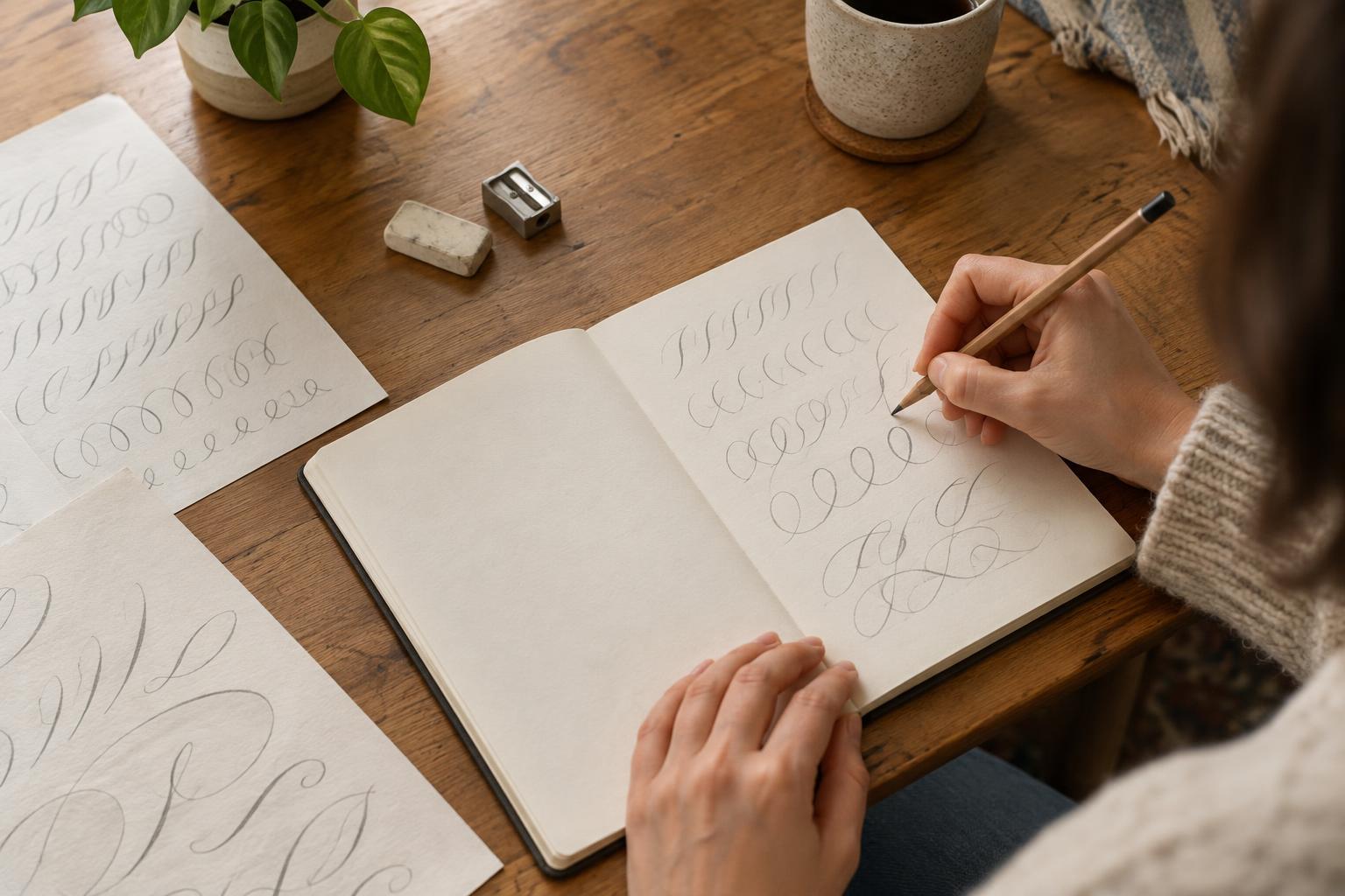
Hand lettering is the practice of drawing letters deliberately rather than writing them at your usual speed. You can begin with an ordinary pencil, an eraser, and a few sheets of paper. A ruler is helpful for drawing guides, but the edge of a notebook can work too. Choose a short word or phrase you like; it will give your practice a purpose without turning the session into a big project.
Set aside 20 to 30 minutes for a first attempt. Use paper you do not mind filling with rough sketches, and keep the pencil marks light enough to erase. If you have a choice, a pencil that feels comfortable in your hand matters more than a particular grade. The goal is to notice how letters are shaped and spaced, not to make a perfect page.
Warm up with simple shapes
Before drawing words, fill a few lines with straight strokes, circles, ovals, and shallow curves. Try making a row of ovals that are roughly the same height, then a row that gradually gets wider. These marks are building blocks for many letters. Move your hand at an easy pace, and pause if you find yourself gripping the pencil tightly.
Next, write the alphabet in plain lowercase letters, leaving room between each one. Pick two or three letters to redraw as shapes rather than as a single quick motion. For example, you might build an “a” from an oval and a short stem. Looking at familiar letters this way makes it easier to change their proportions on purpose. You do not need to invent an elaborate style yet.
Sketch a phrase before darkening it
Choose a phrase of two to five words, such as “slow morning” or “make some time.” Write it once normally to see how much space it needs. Then draw two faint horizontal guides: one for the bottom of most letters and one for their general height. Sketch the phrase between them, leaving wider gaps between words than between letters. If a word feels crowded, erase and shift it before adding detail.
Try one small variation at a time. You could make the first word larger, give the letters rounded corners, or stretch a few letters taller. Keep the words easy to read. When the layout feels balanced, trace over the lines you want to keep with slightly firmer pencil pressure. Erase only after the darker lines are clear, and take care not to rub away your finished strokes.
Use spacing to improve the result
Even carefully drawn letters can look uneven when the spaces between them vary too much. Look at the empty areas, not just the pencil marks. A narrow letter beside a round one may need to sit closer than two wide letters do. Step back from the page or turn it upside down for a moment; either view can help you spot a gap that interrupts the rhythm of a word.
For a simple finishing touch, add weight to selected strokes by drawing a second line beside them and shading the space between. Keep that extra thickness consistent rather than adding it everywhere. You can also leave the phrase in clean pencil. A legible layout with comfortable spacing is a satisfying result on its own.
Make one small thing and save the practice pages
Put your lettering to use on a folded note, a bookmark, or a label for a hobby box. Sketch lightly on the final piece first, using your practice page as a reference. A short phrase is easier to place than a long quote, especially on a small surface. If the finished version differs from the sketch, treat it as another attempt rather than a mistake.
Keep a few early pages so you can see which letter shapes you enjoy drawing. For your next session, repeat the same phrase in a different size or try a new one using the same steps: warm up, sketch, check spacing, and darken. A brief, repeatable routine makes hand lettering an approachable weekend hobby, even when your free time is limited.